easily understand flexbox
For the first three years I wrote CSS, flexbox and I had an arrangement. I would type display: flex, then guess at justify-content and align-items until the boxes landed somewhere reasonable. It worked about 70 percent of the time. The other 30 percent I sat in devtools toggling properties like a slot machine, hoping for three boxes in a row. (You know the feeling. Everyone knows the feeling.)
Turns out the whole thing is two axes and a handful of properties. This is the post I wish existed back then, with pictures, because flexbox is one of those things that clicks visually or not at all.
The only mental model you need
flexbox lays things out along two axes: the main axis and the cross axis. Every property you are about to learn answers one of two questions. Where do things go along the main axis? Where do they go along the cross axis? That is genuinely all of it.
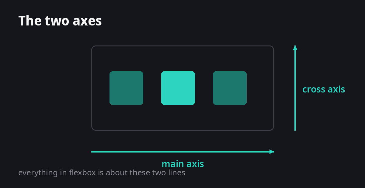
The display switch
One line turns any container into a flex container, and its children line up in a row, left to right:
.container {
  display: flex;
}
That is the on switch. Everything below only works once this line exists, which is worth saying because I once spent twenty minutes wondering why justify-content was doing nothing. It was doing nothing because I forgot the switch.
flex-direction flips the axes
By default the main axis runs left to right (row). Set flex-direction to column and the main axis runs top to bottom instead. The axes flip, which means justify-content and align-items swap jobs. Forgetting this is why centering "randomly breaks" when you switch a layout from row to column.
.container {
  display: flex;
  flex-direction: column; /* main axis is now vertical */
}
justify-content runs the main axis
This is the one everyone mixes up, so here are all six values doing the same job on the same three boxes:
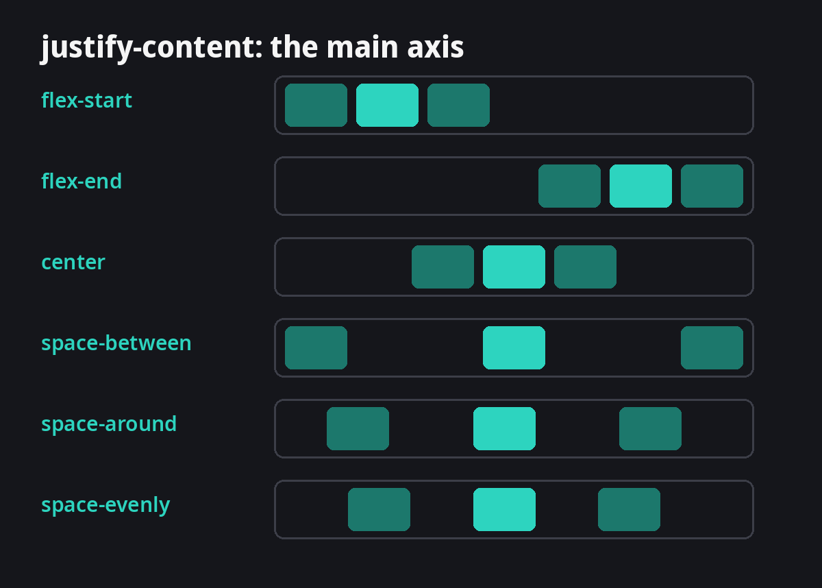
In practice you will use three of these for 95 percent of layouts: flex-start, center, and space-between. Learn those cold, look up the rest when you need them.
align-items runs the cross axis
Same idea, other direction. The default is stretch, which is why your boxes fill the container height and you never questioned it:
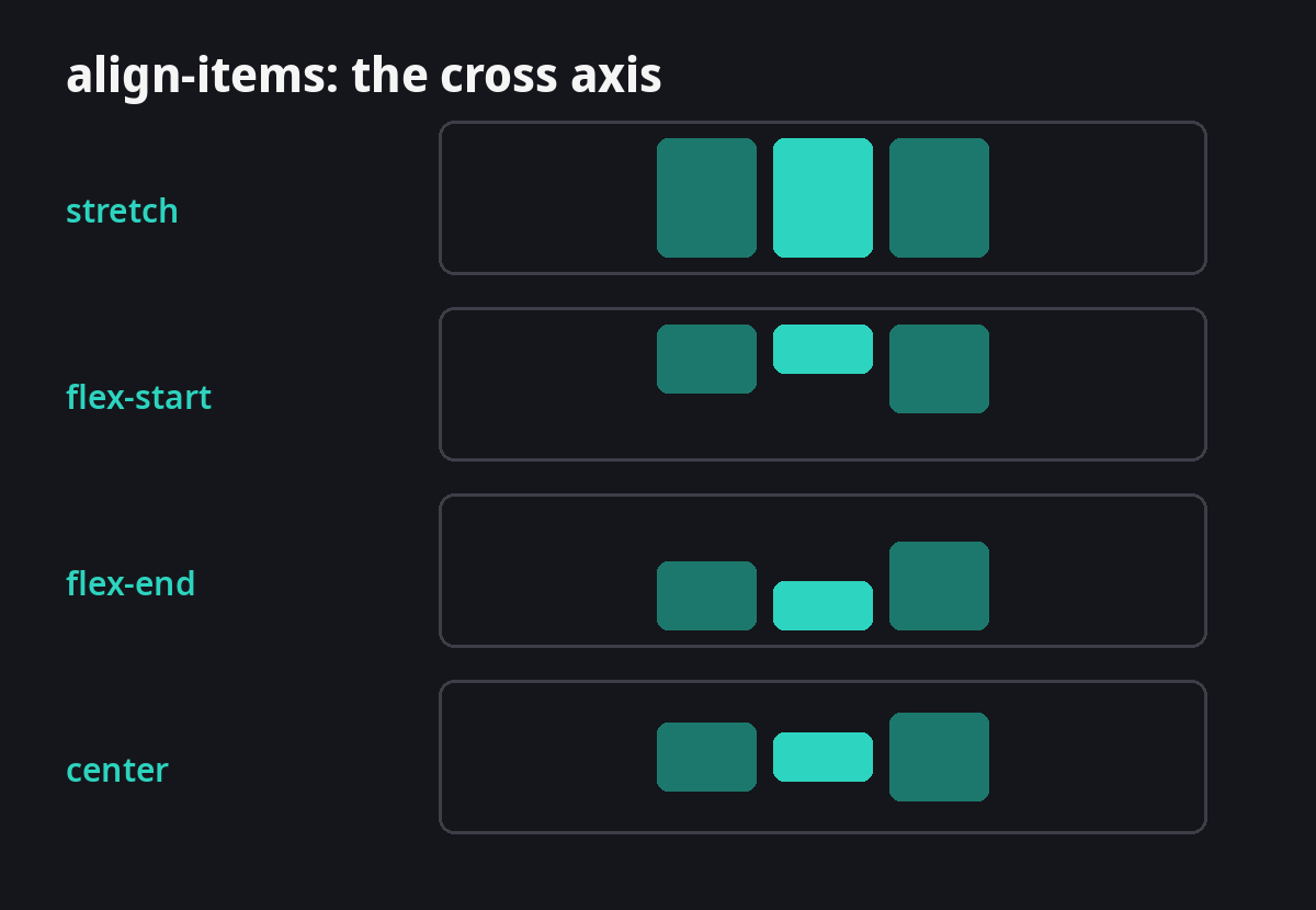
The centering trick, finally explained
The most googled CSS snippet of all time, and now you can read it instead of copying it:
.center {
  display: flex;
  justify-content: center; /* center along the main axis */
  align-items: center;     /* center along the cross axis */
}
Center on one axis, center on the other. Done. No absolute positioning, no transform hacks, no margin auto prayer.
gap killed the margin hacks
Remember putting margin-right on every child except the last one? gap does it properly, with even spacing that does not collapse or double up:
.container {
  display: flex;
  gap: 12px; /* space between children, nothing else */
}
Try it live
Same three boxes. Flip the direction, move them along each axis, watch what changes. This is faster than reading my explanation a second time:
So, what have I learnt?
flexboxis two axes. Name the axis before you reach for a property and half the confusion disappears.justify-contentis the main axis,align-itemsis the cross axis. Mixing those two up was 90 percent of my problem.flex-direction:columnflips the axes, which is why centering breaks when you change direction.- Centering is two lines and now I know which two and why.
gapover margins, every single time.